
QUICK TIP:
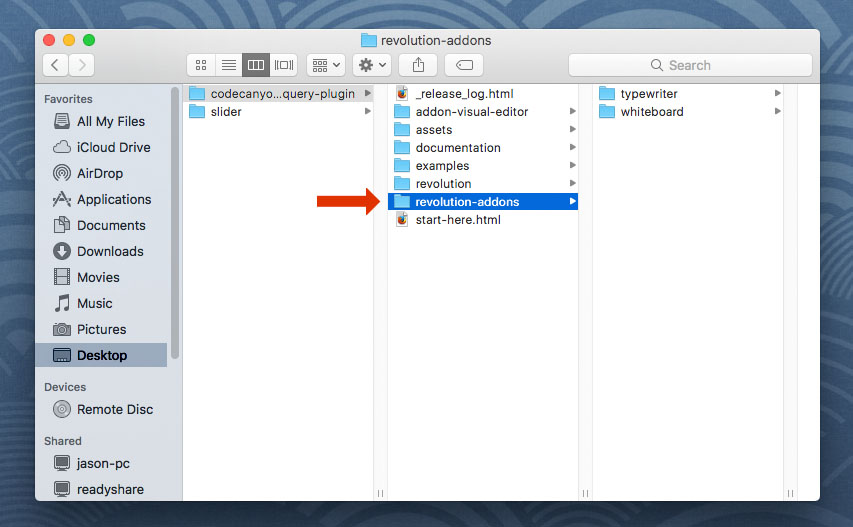
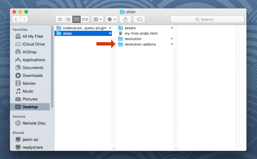
To get started with the Slicey Add-On, first add the "revolutions-addons" folder into your production site:
Next, add the Slicey script. The script should placed below all other scripts on the page.
<!-- SLICEY SCRIPT -->
<script type="text/javascript" src="revolution-addons/slicey/js/revolution.addon.slicey.min.js"></script>
Next, assign a variable to your slider's main settings script as shown in the following example.
var slider = jQuery('#rev_slider_1').show().revolution({
/* ******************** */
/* SLIDER SETTINGS HERE */
/* ******************** */
});
Then initialize the Slicey Addon:
var slider = jQuery('#rev_slider_1').show().revolution({
/* ******************** */
/* SLIDER SETTINGS HERE */
/* ******************** */
});
// initialize the Slicey Add-On
slider.revSliderSlicey();
Next, setup your Slider with a Ken Burns effect:
https://www.themepunch.com/revsliderjquery-doc/ken-burns-effect/
And then add a basic Shape Layer to one of your slides:
https://www.themepunch.com/revsliderjquery-doc/layer-content/#shape
And then convert the Shape Layer into a Slicey Layer by adding the "tp-slicey" class, and also adding the data-attributes shown in the example below.
<!-- add the "tp-slicey" class to the Layer -->
<div class="tp-caption tp-resizeme tp-slicey" data-type="shape"
<!-- scale/zoom offset giving the Layer a 3D effect -->
data-slicey_offset="20"
<!-- enter custom numbers for the CSS3 Blur Filter, -->
<!-- or leave as "inherit" to use the slide's global blur setting (shown in code example below) -->
data-slicey_blurstart="inherit"
data-slicey_blurend="inherit"
<!-- ******************************* -->
<!-- LAYER DATA ATTRIBUTES CONTINUED -->
<!-- ******************************* -->
<div>
<!-- END SLICEY LAYER -->
And finally, add an optional CSS3 box-shadow and CSS3 Blur filter to the KenBurns effect:
<li data-transition="fade"
<!-- apply an optional CSS3 Box Shadow -->
<!-- http://www.cssmatic.com/box-shadow -->
data-slicey_shadow="0 0 20px rgba(0, 0, 0, 0.5)">
<img src="assets/images/notgeneric_bg5.jpg"
alt="Ocean"
class="rev-slidebg"
data-bgposition="center center"
data-bgfit="cover"
data-bgrepeat="no-repeat"
data-kenburns="on"
data-duration="9000"
data-ease="Linear.easeNone"
data-scalestart="100"
data-scaleend="150"
<!-- new KenBurns/Slicey options introduced in version 5.4 -->
data-blurstart="0"
data-blurend="0">
</li>