
QUICK TIP:
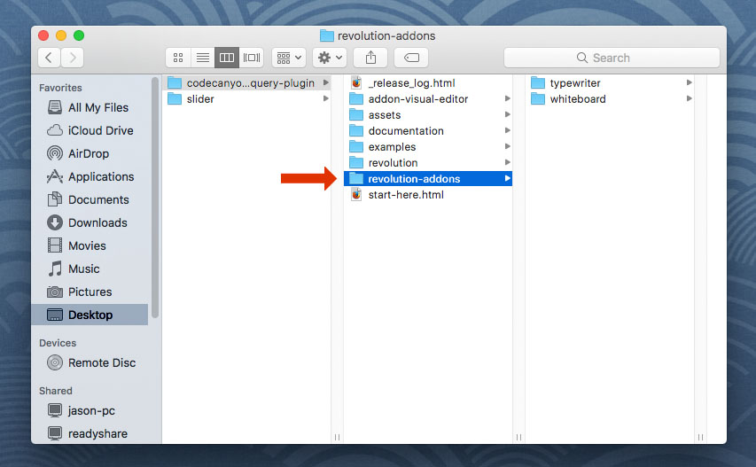
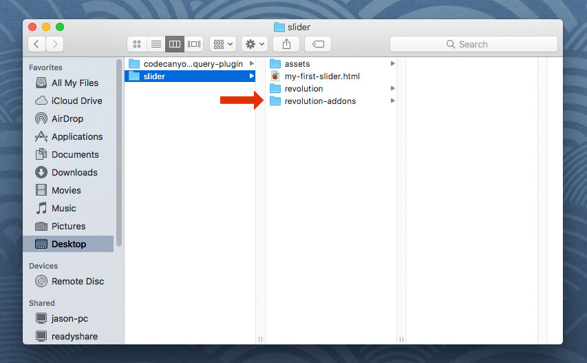
To get started with the Before/After Add-On, first add the "revolutions-addons" folder into your production site:
Next, add the Before/After stylesheet and script. The script should placed below all other scripts on the page.
<!-- BEFORE/AFTER STYLESHEET -->
<link type="text/css" href="revolution-addons/beforeafter/css/revolution.addon.beforeafter.css" />
<!-- BEFORE/AFTER SCRIPT -->
<script type="text/javascript" src="revolution-addons/beforeafter/js/revolution.addon.beforeafter.min.js"></script>
Next, assign a variable to your slider's main settings script as shown in the following example.
var slider = jQuery('#rev_slider_1').show().revolution({
/* ******************** */
/* SLIDER SETTINGS HERE */
/* ******************** */
});
Then initialize the BeforeAfter Addon directly after the slider settings (shown above)
RevSliderBeforeAfter(tpj, revapi265, {
/*
default CSS cursor when hovering over the drag-arrows
https://developer.mozilla.org/en-US/docs/Web/CSS/cursor
*/
cursor: "move",
/*
set to "true" if the slider is a carousel:
https://www.themepunch.com/revsliderjquery-doc/carousels/
*/
carousel: false,
arrowStyles: {
leftIcon: "fa-icon-caret-left", /* left arrow icon class */
rightIcon: "fa-icon-caret-right", /* right arrow icon class */
topIcon: "fa-icon-caret-up", /* top arrow icon class */
bottomIcon: "fa-icon-caret-down", /* bottom arrow icon class */
size: "35", /* arrow icon font size */
color: "#ffffff", /* arrow icon color */
spacing: "10", /* the spacing in pixels between the icons */
bgColor: "transparent", /* arrows container background color */
padding: "0", /* arrows container padding */
borderRadius: "0" /* arrows container border-radius value */
},
dividerStyles: {
width: "1", /* the divider-line size in pixels */
color: "rgba(255, 255, 255, 0.5)" /* the divider-line's color */
}
});
RevSliderBeforeAfter(tpj, revapi265, {
/*
default CSS cursor when hovering over the drag-arrows
https://developer.mozilla.org/en-US/docs/Web/CSS/cursor
*/
cursor: "move",
/*
set to "true" if the slider is a carousel:
https://www.themepunch.com/revsliderjquery-doc/carousels/
*/
carousel: false,
arrowStyles: {
leftIcon: "fa-icon-caret-left", /* left arrow icon class */
rightIcon: "fa-icon-caret-right", /* right arrow icon class */
topIcon: "fa-icon-caret-up", /* top arrow icon class */
bottomIcon: "fa-icon-caret-down", /* bottom arrow icon class */
size: "35", /* arrow icon font size */
color: "#ffffff", /* arrow icon color */
spacing: "10", /* the spacing in pixels between the icons */
bgColor: "transparent", /* arrows container background color */
padding: "0", /* arrows container padding */
borderRadius: "0" /* arrows container border-radius value */
},
dividerStyles: {
width: "1", /* the divider-line size in pixels */
color: "rgba(255, 255, 255, 0.5)" /* the divider-line's color */
},
/*
**************************************************************
All sections below are optional. Uncomment a section to use it
**************************************************************
*/
/* animate the before/after point when the slider is clicked */
/*
onClick: {
time: "500", // the animation's duration in milliseconds
easing: "Power2.easeOut", // the TweenLite easing value: https://greensock.com/ease-visualizer
},
*/
/* add a text-shadow to the arrow icons */
/*
arrowShadow: {
color: "rgba(0, 0, 0, 0.35)",
blur: "10"
},
*/
/* add a box-shadow to the arrow icons container */
/*
boxShadow: {
strength: "3",
color: "rgba(0, 0, 0, 0.35)",
blur: "10"
},
*/
/* add a border to the arrow icons container */
/*
arrowBorder: {
size: "1",
color: "#000000"
},
*/
/* add a box-shadow to the divider-line */
/*
dividerShadow: {
strength: "3",
color: "rgba(0, 0, 0, 0.35)",
blur: "10"
},
*/
});
Next, setup your Slides with your Before/After settings and images:
- "horizontal"
- "vertical"
- "fade"
- "collapse"
- true
- false
- none
- initial
- infinite
- once
- repel
- attract
<!-- BEGIN BEFORE/AFTER SLIDE -->
<li data-transition="fade"
<!-- before/after settings and image urls -->
data-beforeafter='{
"moveto":"50%|50%|50%|50%",
"bgColor":"#e7e7e7",
"image":"solid",
"bgImage":"assets/images/day.jpg",
"bgFit":"cover",
"bgPos":"center center",
"bgRepeat":"no-repeat",
"direction":"horizontal",
"easing":"Power2.easeInOut",
"delay":"500",
"time":"750",
"out":"fade",
"carousel":false,
"bounceArrows":"infinite",
"bounceType":"repel",
"bounceAmount":"5",
"bounceSpeed":"1500",
"bounceEasing":"ease-in-out",
"bounceDelay":"750",
"shiftOffset":"10",
"shiftTiming":"300",
"shiftEasing":"ease",
"shiftDelay":"250"
}'>
<!-- The "before" image for the slide's main background -->
<img src="assets/images/night.jpg" class="rev-slidebg">
<!-- ***************** -->
<!-- SLIDE LAYERS HERE -->
<!-- ***************** -->
</li><!-- END BEFORE/AFTER SLIDE -->
Finally, setup your Slides with your Before/After Layers:
- "before"
- "after"
<!-- BEGIN BEFORE/AFTER LAYER -->
<div class="tp-caption tp-resizeme"
data-beforeafter="before"
data-frames='[{"delay": 0, "speed": 300, "from": "opacity: 0", "to": "opacity: 1"}, {"delay": "wait", "speed": 300, "to": "opacity: 0"}
]'></div><!-- END BEFORE/AFTER LAYER -->