
Table of Content
- Layout
- Breakpoints
- Advanced Sizes
- Fullscreen Options
- Module Position
- Module Background
- Border, Overlay & Shadow
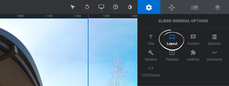
Layout
1. Type
Choose ‘Slider’ for a Module with multiple Slides, “Scene” for a single-scene Module, and Carousel for a Module with multiple Slides presented as a traditional slider carousel.
2. Sizing
Choose ‘Auto’ to have the Module inherit the same width as your page’s content container, ‘Full Width’ to have the module always stretch across the page, and ‘Full Screen’ to have the module adapt to the same size as the window.

Breakpoints
1. Enable/Disable
Activate a breakpoint for the device size. The module will then be resized based on the width (#2) and height (#3).
2. Width
The width the Module should adapt to when the breakpoint occurs.
3. Height
The height the Module should adapt to when the breakpoint occurs.

Advanced Sizes
1. Max Width
Set an optional maximum width for the module, regardless of the size of the container its placed inside. (Only available on “Auto” layout)
2. Min Height
Set an optional minimum height for the Slider. (Only available on “Auto” and “Fullscreen” layout)
3. Wrapper Max Height
Set an optional minimum height for the Slider. (Available on all three layout)
4. Keep Breakpoint Heights
The Module’s height will always equal the height(s) set in the breakpoints.
5. Respect Aspect Ratio
Normally a module’s height will never grow larger than its designated breakpoint height. Enabling this option effectively removes this restriction.
6. Grid = Module
The Layer’s Area values will always equal the same size as the Module’s outer container, which is based on how the Module fits inside your web page’s content container.
7. Force Overflow Visible
Allow content to bleed outside the Module’s outer container.
8. Fixed on Top
The Module will always be positioned at the top of the page. Useful for “sticky” menus.

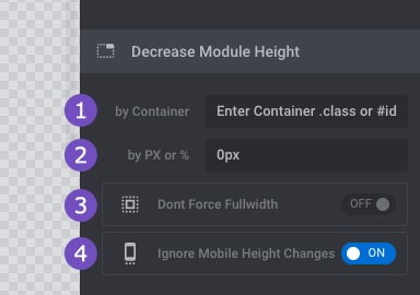
Fullscreen Options
For FullScreen Layouts, you may want the Module to fit perfectly inside the window’s viewport between a top menu, footer or other content. #1 and #2 below can be used to achieve this.
1. by Container
Enter a jQuery selector for the content you wish to make space for. For example, this could be your main menu’s tag name or class name.
2. by PX or %
Decrease the Fullscreen Module’s height by a specific amount of pixels.
3. Don’t Force Fullwidth
Useful for when you’d like a “Full screen height” but still want your Module to fit inside the page’s content container, which may have a boxed width.
4. Ignore Mobile Height Changes
This option will ignore the browser address bar that changes the height of the module when scrolling on mobile.
Module Position within Wrapper
1. Align
Useful if the module has a max-width and is placed inside a page’s content container that’s larger than the module’s width.
2. Top/Bottom Margin
Add space above and below the module relative to the other content on your web page.

Module Background
Set the module’s main background to transparent or a color/gradient

Or enable “Use Image” to apply a global background image to the Module

Border, Overlay & Shadow
1. Overlay
Add an optional mesh-type overlay to the Module for additional styling.
2. Shadow Type
Add one of 8 predefined shadow graphics to give the Module a 3D visual.
3. Gap (Border)
A value entered here will act as CSS padding for the module.


