
Table of Content
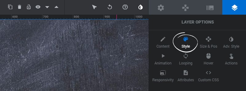
Style

Font & Icon Styles
Font & Icon Style options can be edited for Text and Button Layers.
1. Font Size
Set the font-size for the text in pixels.
2. Line Height
The CSS line-height for the Layer. This is useful for text with multiple lines.
3. Font Weight
Choose if your text should be “bold”.
4. Letter Spacing
Optional spacing between letters. Useful for certain font families.
5. Font Family
Choose between hundreds of available Google fonts.
6. Text Color
Set the color of the Layer’s text.
Click the “More” button for additional font styling options
1. Italics
Choose if the text should appear in italics.
2. Text Decoration
The CSS text-decoration for the Layer.
3. Capitalize
Choose the CSS text-transform for the Layer.
4. Selectable
Choose if the text can be selected by the user or not.


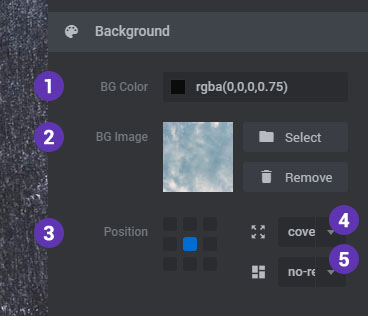
Background
1. Background Color
Set the Layer’s background to a solid or semi-transparent color or gradient.
2. Background Image
Set an optional background-image for the Layer.
3. Background Image Position
The CSS background-position of the image.
4. Background Image Sizing
The CSS background-size of the image. “Cover” is recommend.
5. Background Image Repeat
The CSS background-repeat of the image. Use “no-repeat” for regular images, and “repeat” for pattern-type backgrounds.
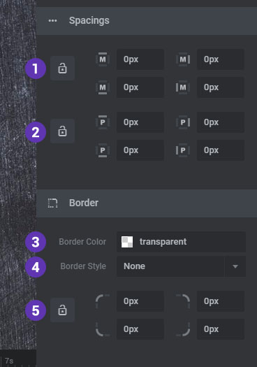
Spacings & Border
1. Margins
Set the Layer’s top/right/bottom/left margin, and click the “lock” button if you want these values to always be honored regardless of responsiveness.
2. Paddings
Set the Layer’s top/right/bottom/left padding, and click the “lock” button if you want these values to always be honored regardless of responsiveness.
3. Border Color
Set the a color for the optional border.
4. Border Style
Set this to “solid” if you’d like to display a border for the Layer.
5. Border Radius
Add an optional CSS border-radius to the Layer.
SVG Styles
1. SVG Color
Set the SVG icon’s main color
2. Stroke Color
The color of the SVG stroke if a Stroke Size is set above 0px.
3. Stroke Size
An svg stroke adds a border/outline inside and outside the graphic’s drawing.
4. Stroke Dashes
Converts the stroke to dashed lines.
5. Stoke Dash Spacing
The spacing between dashes if the Stroke Dash is set above 0.

Advanced Style

Basic Transform
1. Rotation X
Add a rotateX transform to the currently selected Layer
2. Rotation Y
Add a rotateY transform to the currently selected Layer
3. Rotation Z
Add a rotateZ transform to the currently selected Layer
4. Opacity
Adjust the opacity/transparency for the currently selected Layer
Box Shadow
1. Effect *
Enable the box-shadow for the Layer
2. Shadow on *
Choose if the shadow should be applied to the Layer’s main container or the Layer’s parallax container.
3. Offset-X
The “x” (horizontal) position of the Shadow
4. Offset-Y
The “y” (vertical) position of the Shadow.
5. Blur
The blur value for the Shadow.
6. Spread
The sizing of the Shadow. This must have a value higher than “0” for the shadow to be visible.
7. Color *
The box-shadow’s color.
* Will be applied globally to all responsive viewports.

Example CSS box-shadow:
Offset-X | Offset-Y | Blur | Spread | Color
box-shadow: 2px 2px 2px 1px rgba(0, 0, 0, 0.2);
Text Shadow
Text Shadow options can be edited for Text and Button Layers.
1. Effect *
Enable the text-shadow for the Layer
2. Offset-X
The “x” (horizontal) position of the Shadow
3. Offset-Y
The “y” (vertical) position of the Shadow.
4. Blur
The blur value for the Shadow.
5. Color *
The text-shadow’s color.
* Will be applied globally to all responsive viewports.

Example CSS text-shadow:
Offset-X | Offset-Y | Blur | Color
text-shadow: 3px 3px 3px rgba(0, 0, 0, 0.2);
Text Stroke
Text Stroke options can be edited for Text and Button Layers.
1. Effect *
Enable the text-stroke for the Layer
2. Stroke Width
Adjust the width of the Stroke Effect by px.
3. Stroke Color *
The text-stroke’s color.
* Will be applied globally to all responsive viewports.

Example CSS text-stroke:
Width | Color
text-stroke: 1px rgba(0, 0, 0, 0.2);
Blend Mode
1. Blend Mode
Add an optional CSS mix-blend-mode to the Layer.
2. Show in Editor
Disable this option if you’d like the hide the effect in the admin editor view.

Spike Masks
1. Left Spike
Adds Spike to the left side of the Layer. (Requires Background Color/Image)
2. Left Spike Width
Adjust the width of the left spikes
3. Right Spike Width
Adds Spike to the right side of the Layer. (Requires Background Color/Image)
4. Right Spike Width
Adjust the width of the right spikes


Sharp Corner Extensions
1. Left Corner
Adds a sharp left corner to the Layer. (Requires Background Color)
2. Right Corner
Adds a sharp right corner to the Layer. (Requires Background Color)


