
Table of Content
Activate Responsive Breakpoints
Enable the four available Breakpoints for your Module to activate responsive editing. Learn more about how breakpoints work here.


Next, switch between the different Breakpoints to edit your Layers for each viewport.

Layer Responsive Settings
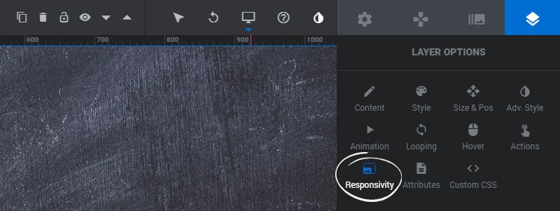
Choose how your Layers should resize and reposition, and set their visibility for different screen sizes.

Intelligent Inheriting

If Intelligent Inheriting is set to OFF, the Layer’s size and position will need to be set manually for each responsive viewport.
Clicking the Reset All Values from Desktopbutton will reset the Layer’s size and position for all viewports to the Layer’s size/position for its Desktop view.

If Intelligent Inheriting is set to ON, the Layer’s size and position will automatically be resized/repositioned as the Module resizes.
Clicking the Inherit All Values from Desktopbutton will reset the Layer’s size and position for all viewports automatically.
Responsive Behavior
1. Resize Between Devices
Enable this option if you want the Layer to resize for the different screen sizes.
2. Responsive Offsets
Enable this option if you want the Layer to reposition itself for the different screen sizes.
3. Responsive Children
If a Layer has nested HTML markup, the nested HTML will also be resized.

Device Visibility
1. Desktop View Visibility
Show/hide the Layer when the screen size is in the Desktop Viewport.
2. Laptop View Visibility
Show/hide the Layer when the screen size is in the Laptop Viewport.
3. Tablet View Visibility
Show/hide the Layer when the screen size is in the Tablet Viewport.
4. Phone View Visibility
Show/hide the Layer when the screen size is in the Phone Viewport.
5. Hide Under Width
Show/hide the Layer when the screen size is below the “Marked Layers” number set in the Module’s General Settings.
6. Show if mouse over Slider
Choose to only show the Layer when the user has hovered their mouse over the Module.

Responsive Size & Position
Switch between the Responsive Views to resize and reposition your Layers for the different breakpoints.

And then adjust the Layer’s size and position for each of the different breakpoints.

And finally, when positioning your content, make sure your Layers are placed inside the Layers Grid guidelines.
This helps to ensure that they never bleed outside the Module. The Layers Grid size is defined in the Module’s Breakpoints.
Correct:

Incorrect:


