
Table of Contents
1. Type of Grid
1.1 Post-based Grid
One of the most common uses of Essential Grid is to have a grid based on your website’s posts. It’s almost like creating a super-awesome “blog home page”, where instead of a traditional list of post titles and excerpts, each post is represented briefly as an Essential Grid Item.
A post-based grid works by first assigning a Grid a post-type source:

To simply pull in all of posts from the selected “Post Type”, do not select anything from the “Post Categories” section.
Or, assign a combination of one of more categories/tags to narrow down what posts from the selected “Post Type” get pulled into the Grid.

And then choose the “Category Relation”.
AND: A post will only be included in the Grid if it includes ALL of the selected categories/tags.
OR: The post only needs to have at least one of the selected categories/tags to be included in the Grid.

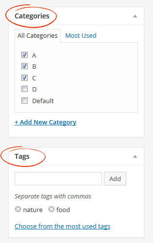
The categories and/or tags will need to already be assigned to the posts you want to pull into the grid. Chances are, your blog posts already have categories and tags assigned:

You can easily add categories and tags by selecting the “Quick Edit” for your posts:


Or you can edit categories/tags from within the post itself:

Quick Tip
View this article for a list of additional possibilities for customizing which posts are added to your Grids.
1.2 Custom Grid
Custom Grids are manually generated grids that are not based on posts; i.e. you create the items right from within the plugin’s admin.

When building a Custom Grid, you add items individually, starting with what type of item you wish to add:

As shown above, you can add items based on video, SoundCloud, or no media at all (i.e. “Simple Content”), but the most common usage is to add items based on images from your WordPress main media gallery. And when creating Image-based items, you can easily select several images at once with the “Bulk” option.


Adding a Blank Item to a Custom Grid allows displaying empty spaces between grid items.
Note
The Blank Item feature is only available in version 2.3 and above.
The “Hide Blank Items At” option allows you to hide the “Blank Item” at a certain breakpoint or always display it.
1.3 Social/Video Streams
Populate your Essential Grids with your YouTube or Vimeo Videos, or imagery from your Instragram, Flickr, Facebook and Twitter accounts. Full Documentation

View full Documentation for Special Content Stream sources
2. Main Media
The main media for an Essential Grid item is usually represented by an image, but can also be other media content such as video.
Whether you’re using a post-based grid or a custom grid, in order for the main media to appear, it needs to be officially selected as one of the “Media Sources”:

When using a post-based grid, the image will be drawn from the post itself. There are three possible ways an image can be pulled from a post:

Only one of these sources are needed, so you can choose what’s most convenient for you. Each option pulls the image from the individual post:
1. Featured Image:

2. Alternative Image:

3. First Content Image:

And for some reason if an image isn’t assigned to a post in one of the three ways listed above, when editing your grid, in the “Source -> Media Source” section, you can also set a “Default Image” that will be displayed in these cases.

And finally, whenever you upload an image to WordPress, multiple versions of the image are created automatically (thumbnail version, etc.). Because sometimes images can be quite large, and you may not need such a large image when it’s placed inside an Essential Grid item, you can use the “Set Image Source Type” option to choose which version of your images you’d like to load into Essential Grid.

Using Video?
CLICK HERE to learn how video works with Essential Grid.
3. Skin Template
Essential Grid comes with over 40+ prebuilt hand-crafted designs that you can choose from. These designs can be viewed and customized by visiting the “Item Skin Editor” section of the plugin:

Every new grid will have the “Washington” skin assigned to it by default. To assign a different template skin to your grid, visit the “Skins” tab, and select a new skin of your choice:

An “Even” skin typically has content that’s displayed on top of the main media:

A “Masonry” skin will often have content on top and also below the main media:

When a “Masonry” skin is chosen, its behavior will vary based on the the grid’s main layout:

1. “Masonry” skin combined with “Even” grid layout
The content below the main media will only appear on mouseover, and will also “float” on top of any grid items below it.

2. “Masonry” skin combined with “Masonry” grid layout
The content below the main media will always be displayed by default, and the content does not “float” on top of other grid items like the previous example.

In closing, any skin can be chosen regardless of the grid’s main layout. But when a “Masonry” skin is chosen, its view will vary based on your grid’s main layout.
4. Grid Layout
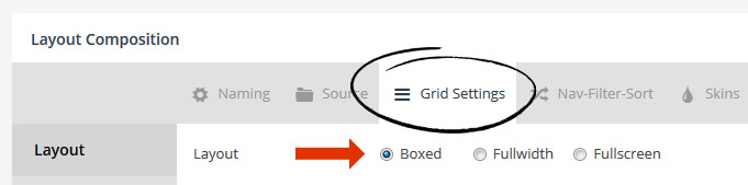
Essential Grid includes several layout options that can be found inside the “Grid Settings” tab.
The most common main layout is “Boxed”, which means the grid will always inherit the same width as the rest of the page’s main content.
The actual width of the items will be based on the total width of the grid itself (for “Boxed”, this would be the same width as the rest of the page’s content), divided by the number of columns chosen.
For example, if your theme’s main content area is normally 1000px at full size (i.e. “Desktop Large”), and the grid’s “Desktop Large” columns were set to “4”, each grid item’s width would be 250px wide.
- Grid Item Width = Total Grid Width / Number of Columns
Columns can be set per screen size, as shown in the following screenshot:

There are three main “Grid Layouts” that can be chosen from. “Even”, “Masonry” and “Cobbles”:
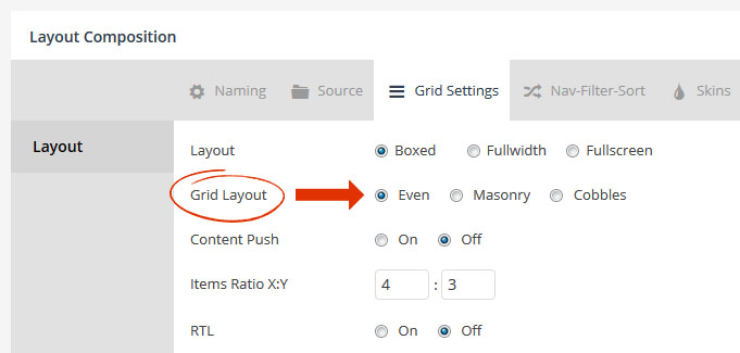
4.1. Grid Layout -> Even
When an “Even” layout is chosen, all grid items will be 100% symmetrical. This means they’ll always be the exact same size as one another like the following example:

For an “Even” grid layout, the height of the grid item is based on the individual grid item’s width, in relation to the “Items Ratio X:Y” setting.
So if our individual grid items have a width of 250px, and an “Items Ratio” of “4×3”, the grid item’s height would be around 188px tall.
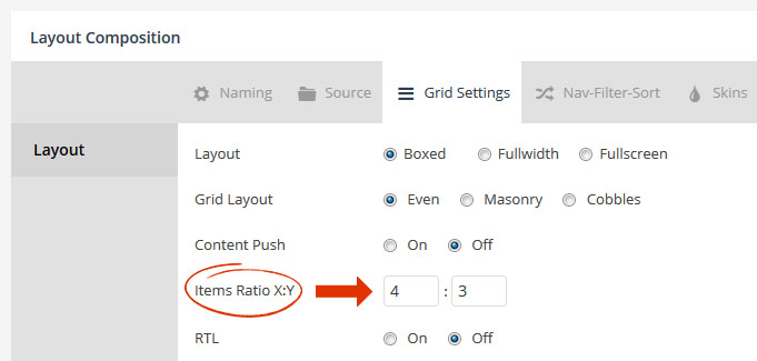
Calculations used to determine the grid item’s actual size for an “Even” grid layout:
- Grid Item Width = Total Grid Width / Number of Columns
- Grid Item Height = Grid Item Width * (Items Ratio Y / Items Ratio X)
- Special Note:
When using an “Even” grid, in order to achieve perfect symmetry images will often be cropped. But if showing the entire image is of the utmost importance, edit the element from the Grid’s preview, and choose “Contain” for the “Media Fit” option. Just keep in mind that this will often create blank space on the top/bottom or sides of the image, so you may want to consider using a Masonry Layout instead.


Result:
No parts of the image are cropped anymore, but this also results in blank space on the top and bottom of this particular image.

Quick Tip
Want to remove the blank space color when using “Contain” for the “Media Fit”? From the Item Skin Editor, set the item’s background to “transparent”.
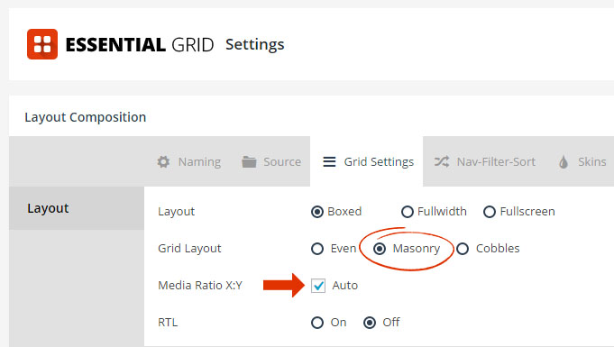
4.2 Grid Layout -> Masonry
When a “Masonry” grid layout is chosen, the height of the items can vary:

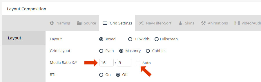
The main difference between an “Even” grid layout and a “Masonry” grid layout, is that “Even” layouts use the “Items Ratio X:Y” to determine grid item height. But “Masonry” layouts have the option to use the image’s original size ratio instead, via the “Media Ratio X:Y -> Auto” option:
For example, let’s say an image is originally sized at 1000×500 (which would be a 2×1 ratio). When a “Masonry” layout is combined with “Media Ratio: Auto”, the grid item will always conform to this exact ratio. And because different images sized differently to begin with, this is how “Masonry” layout grid items end up with varying heights.
Special Note
Image cropping will never occur when using a “Masonry” grid layout combined with an “Auto” Items Ratio.
Calculations used to determine the grid item’s actual size for a “Masonry” grid layout with an “Auto” Items Ratio.
- Grid Item Width = Total Grid Width / Number of Columns
- Grid Item Height = Grid Item Width * (Image Original Height / Image Original Width)
Quick Tip
To achieve “Even” sized grid items with a Masonry Layout, uncheck “Auto” for the Items Ratio, and then enter a fixed ratio to be used for the Grid’s image sizing as shown below.
4.3 Grid Layout -> Cobbles
A “Cobbles” layout is similar to an “Even” layout, in that a symmetrical grid will be drawn based on the same size calculations that are used for an “Even” grid layout.
But when a “Cobbles” layout is chosen, you have the ability to spread each individual item across multiple columns or rows, which allows for creating some really cool custom layouts like the following example:

When “Cobbles” is chosen as the grid’s layout, you can assign a “Cobbles Pattern” in two ways. The first is to create a global pattern (global pattern shown below is the exact pattern used to create the example above).
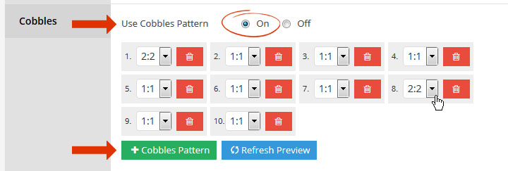
Or you can assign a pattern manually to each individual item:


Here’s a visual of each Cobbles pattern applied to our original example:

Special Note
Similar to an “Even” layout, image cropping will also sometimes occur when a “Cobbles” layout is used.

